Making The Upgrade Screen More "Metal"
REBEL SECTOR » Devlog
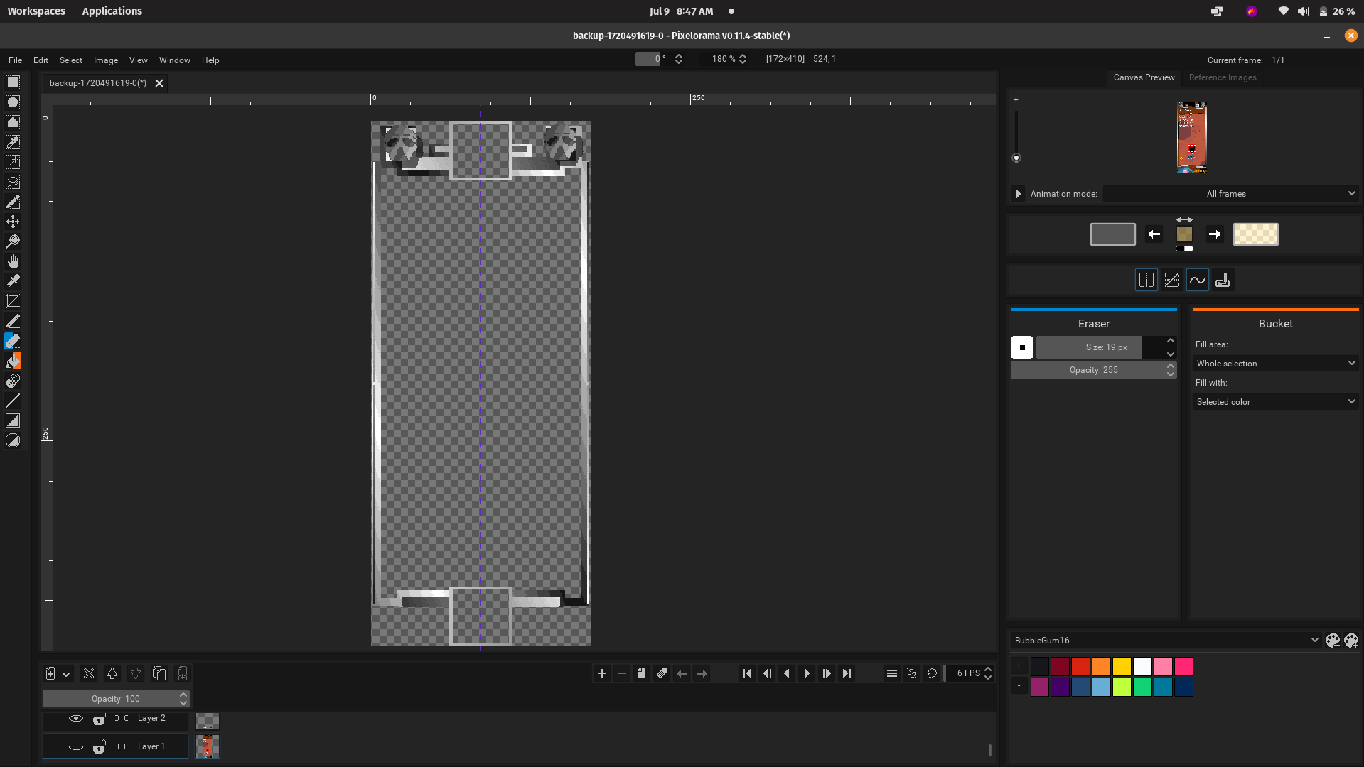
The UI elements for REBEL SECTOR will attempt to copy a heavy metal aesthetic. Inspiration was heavily taken from the RAIDEN logo. Note the sharp edges and the 16BIT dithering:

Below is the frame for upgrade items on the store page (WIP).

Get REBEL SECTOR
Download NowName your own price
REBEL SECTOR
Build a Rebel Squadron and plunder loot in this arena space shooter rougelike..
| Status | In development |
| Author | Reokie |
| Genre | Shooter |
| Tags | 2D, Arcade, Bullet Hell, Indie, micro-rpg, Retro, Roguelike, Singleplayer, Top-Down, Top down shooter |
| Languages | English |
More posts
- Introducing the VOID空白 system.Jul 24, 2024
- New Screenshots Added to PageJul 20, 2024
- REBEL SECTOR 0.1.10Jul 20, 2024
- Summer Demo 2!Jul 13, 2024
- Linux (Pop-os) is great for developing games.Jul 12, 2024
- BUG FIXED - Unable to add more than 3 allies.Jul 07, 2024
- BUG FIXED - "An error occurred while starting the application"Jul 07, 2024
- "Finders keepers, TURKEY!"Jul 06, 2024
- New Website LookJul 05, 2024

Leave a comment
Log in with itch.io to leave a comment.